![]()
2. Customizations
This chapter discusses the various customizations that can be applied to cornerhex.cornerplot. For this puporse we create random data with 50000 samples and 4 features.
[1]:
Ndims, Nsamples = 4, 50_000
[2]:
import numpy as np

D = 2.*np.random.rand(Ndims, Ndims)-1.
cov = np.dot(D, D.T)
mean = 20.*np.random.rand(Ndims) - 10.

data = np.random.multivariate_normal(mean, cov, size=Nsamples)
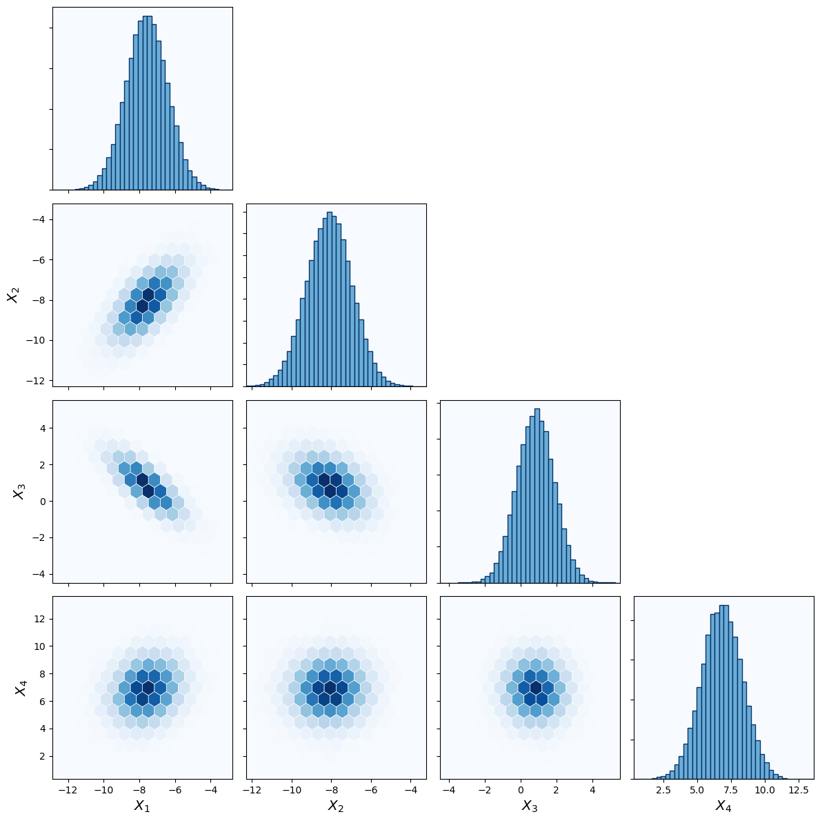
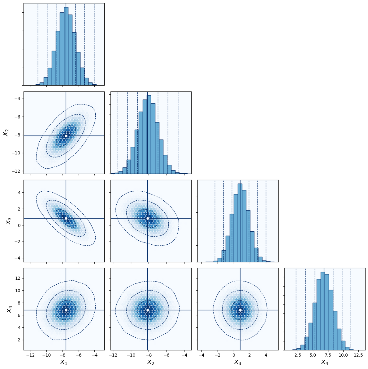
Adding feature labels
It is possible to add labels of the data features. LaTeX notion is allowed. We simply call the features \(X_i\) here.
[3]:
labels = ["$X_{{{}}}$".format(i+1) for i in range(Ndims)]
[4]:
from cornerhex import cornerplot
[5]:
cornerplot(
    data,
    labels=labels
);

Modifying number of bins
The number bins in the histgram and the number of hexbins in \(x\)-direction can be modified with the hist_bins and hex_gridsize keywords. Default values are 20 and 30 respectively.
[6]:
cornerplot(
    data,
    hex_gridsize=15,
    hist_bins=40,
    labels=labels
);
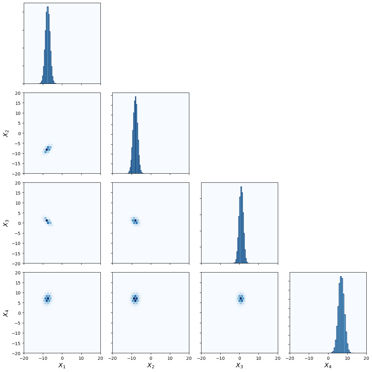
Changing axis limits
By default the axis limits are the minimum and maximum values of each feature respectively. Custom axis limits can be set with the limits keyword argument.
It can be a list with the minimum and maximum values of the axis limits that is applied to all features.
[7]:
limits = [-20., 20.]
[8]:
cornerplot(
    data,
    labels=labels,
    limits=limits
);
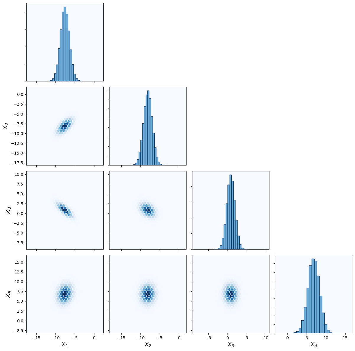
It is furthermore possible to specify the limits for every feature separately.
[9]:
limits = np.vstack((mean-10, mean+10)).T
[10]:
cornerplot(
    data,
    labels=labels,
    limits=limits
);
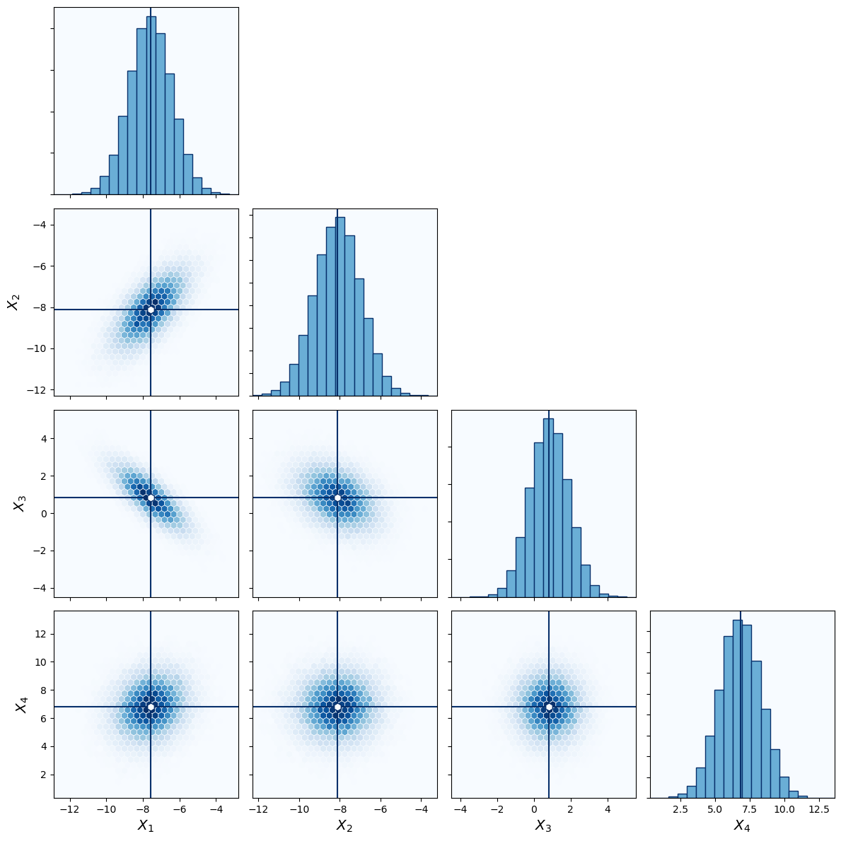
Highlighting specific values
It is often usefull to highlight specific values in the corner plot. In this example we want to highlight the true mean values of the features that we have randomly picked above.
[11]:
cornerplot(
    data,
    highlight=mean,
    labels=labels
);
Adding \(\sigma\) contour levels
It is additionally possible to add contour lines of the \(\sigma\) levels of the data. In this example we want to display the \(1\sigma\) and \(2\sigma\) levels. Plotting the contour lines requires smoothing the hexbin histogram data. This can be accessed via the sigma_smooth keyword. default value is 3.
[12]:
cornerplot(
    data,
    highlight=mean,
    labels=labels,
    sigma_levels=[1, 2, 3],
    sigma_smooth=3
);
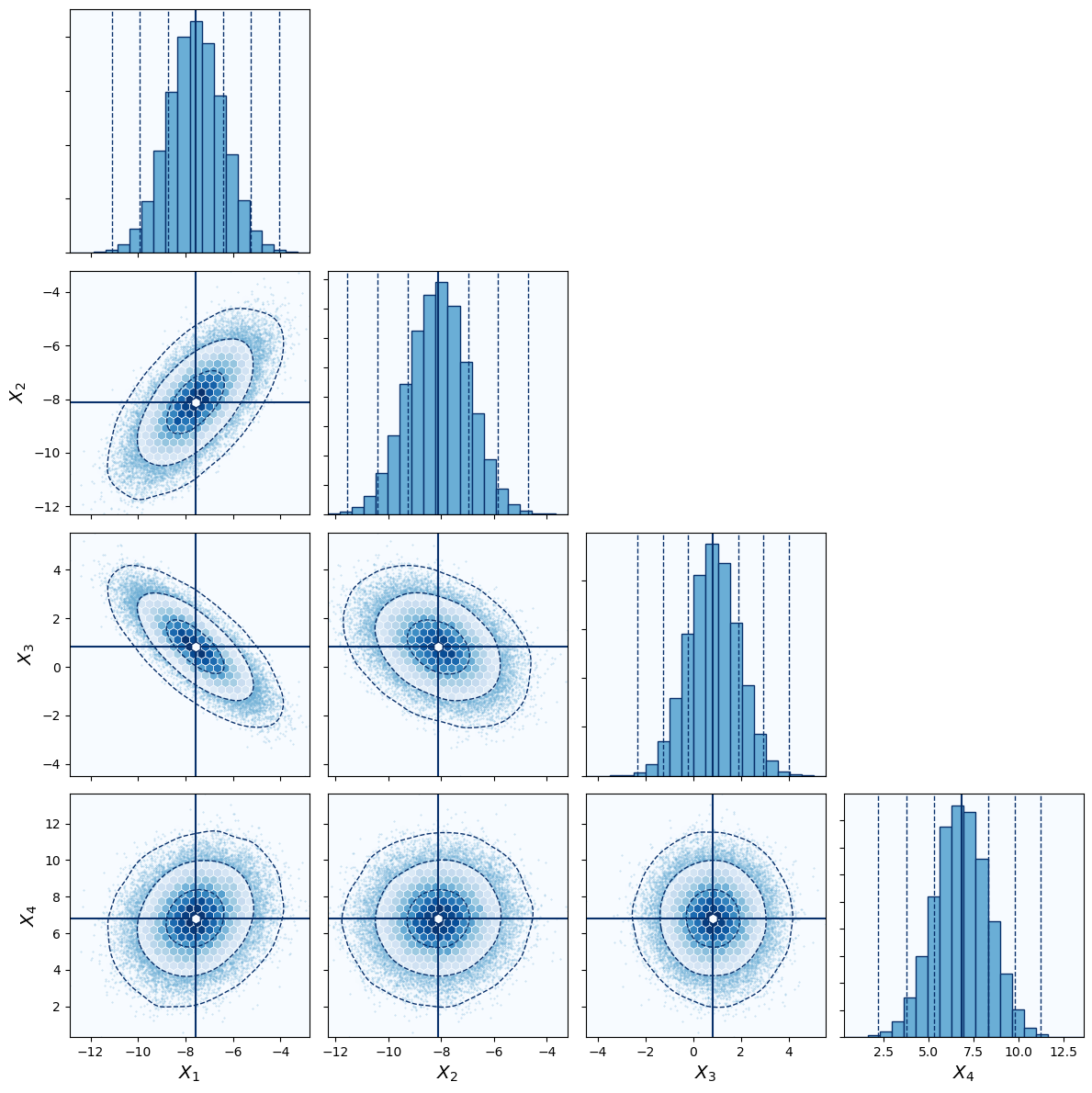
Displaying scatter plot outside of \(\sigma\) contours
To show scatter plots of individual data points in low density regions, use the scatter_outside_sigma keyword argument, which only plots data points outside a given \sigma threshold.
[13]:
cornerplot(
    data,
    highlight=mean,
    labels=labels,
    scatter_outside_sigma=2,
    sigma_levels=[1, 2, 3],
    sigma_smooth=3
);
Displaying quantiles
It is possible to specific quantiles as title of the histograms. In this example we want to display the mean values of the features computed from the dataset. The mean values is the [50] quantile.
[14]:
cornerplot(
    data,
    highlight=mean,
    scatter_outside_sigma=2,
    sigma_levels=[1, 2, 3],
    sigma_smooth=3,
    title_quantiles=[50]
);
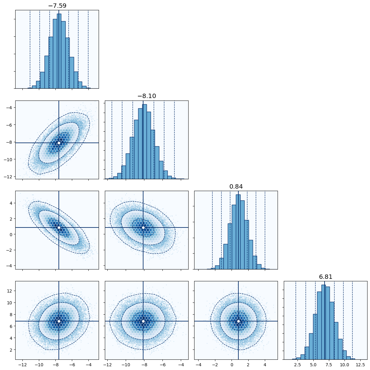
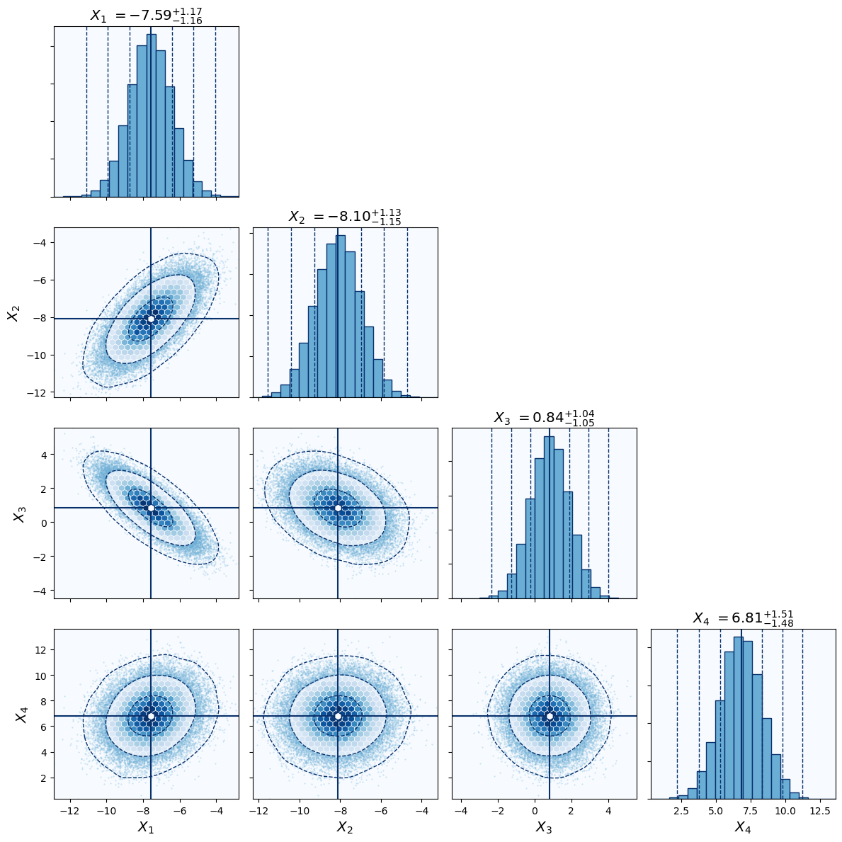
Additionally we can plot the \(1\sigma\) intervals of the mean. For this we need to now what the \(1\sigma\) quantiles of a normal distributions are. We utilize the helper function cornerhex.sigma_to_quantile for this purpose.
[15]:
from cornerhex import sigma_to_quantile

quantiles = [50-sigma_to_quantile(1.), 50, 50+sigma_to_quantile(1.)]
If the feature labels are given they will be displayed in the title as well.
[16]:
cornerplot(
    data,
    highlight=mean,
    labels=labels,
    scatter_outside_sigma=2,
    sigma_levels=[1, 2, 3],
    sigma_smooth=3,
    title_quantiles=quantiles
);
Displaying Pearson correlation coefficient
It is furthermore possible to display the Pearson correlation coefficient \(\rho\) in each hexbin plot with the show_correlations keyword.
[17]:
cornerplot(
    data,
    highlight=mean,
    labels=labels,
    show_correlations=True,
    scatter_outside_sigma=2,
    sigma_levels=[1, 2, 3],
    sigma_smooth=3,
    title_quantiles=quantiles
);

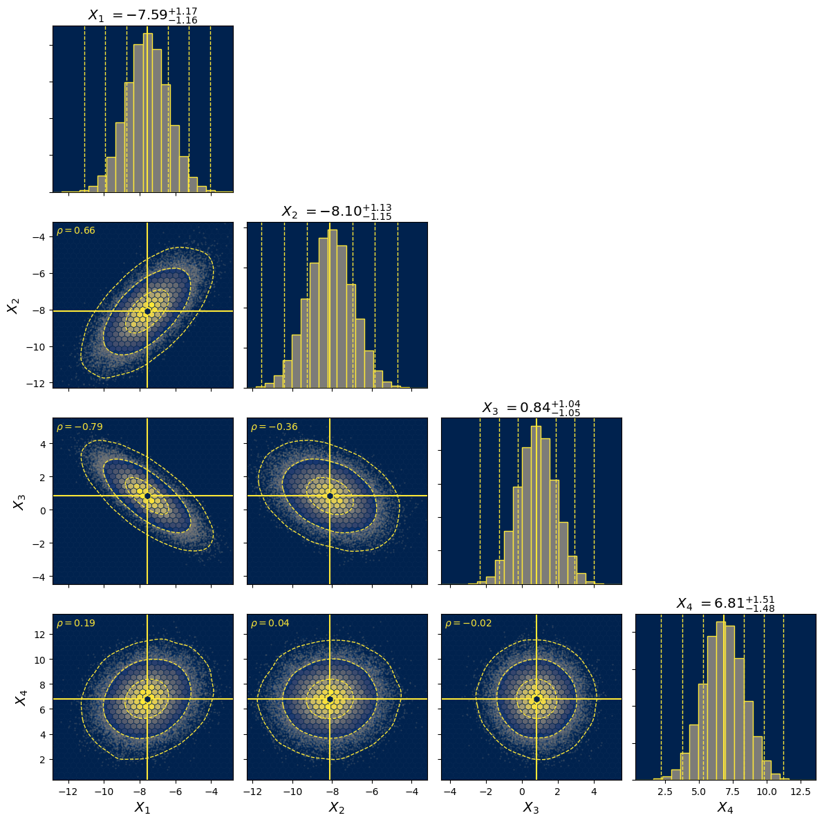
Changing colormap
The colormap can be modified by either specifying a string with a valid name of a colormap or by passing a colormap object itself. The colors of line will be changed accordingly.
[18]:
cornerplot(
    data,
    cmap="cividis",
    highlight=mean,
    labels=labels,
    show_correlations=True,
    scatter_outside_sigma=2,
    sigma_levels=[1, 2, 3],
    sigma_smooth=3,
    title_quantiles=quantiles
);
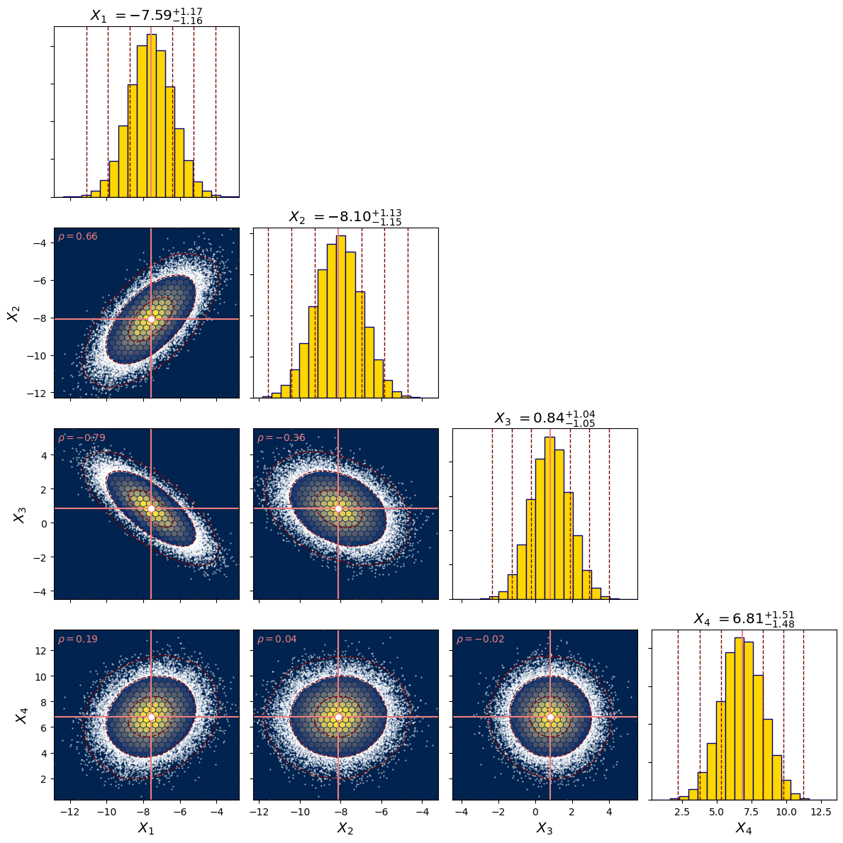
Changing line and textcolor
The edge-, face- and background colors of the histograms, the linecolors of the \(\sigma\) contours and the highlights, the color of the scatter points and their \(\alpha\)-tranparency value, as well as the textcolor of the correlation coefficients adapt to the chosen colormap. Additionally they can be specified as well.
[19]:
cornerplot(
    data,
    cmap="cividis",
    correlation_textcolor="lightcoral",
    highlight=mean,
    highlight_linecolor="lightcoral",
    highlight_markercolor="white",
    hist_backgroundcolor="white",
    hist_edgecolor="navy",
    hist_facecolor="gold",
    labels=labels,
    show_correlations=True,
    scatter_alpha=1.,
    scatter_markercolor="white",
    scatter_outside_sigma=2,
    sigma_levels=[1, 2, 3],
    sigma_linecolor="maroon",
    sigma_smooth=3,
    title_quantiles=quantiles
);
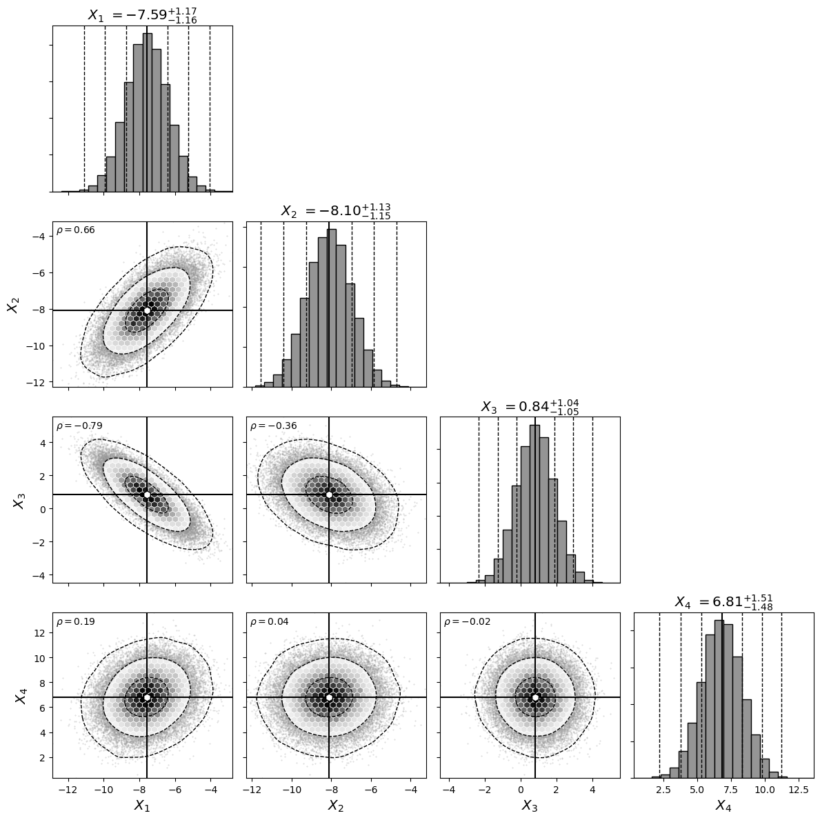
Just because you can change the colors, does not mean that you should. It is often best to use a simple color scheme.
[20]:
cornerplot(
    data,
    cmap="Greys",
    highlight=mean,
    labels=labels,
    show_correlations=True,
    scatter_outside_sigma=2,
    sigma_levels=[1, 2, 3],
    sigma_smooth=3,
    title_quantiles=quantiles
);
Saving plots
cornerhex.cornerplot returns the figure and axes objects of the plots, which can be used to further modify or to save the plot.
[21]:
fig, ax = cornerplot(
    data,
    highlight=mean,
    labels=labels,
    show_correlations=True,
    scatter_outside_sigma=2,
    sigma_levels=[1, 2, 3],
    sigma_smooth=3,
    title_quantiles=quantiles
);

[22]:
fig.savefig("example.jpg")